
Spatial Report: 100 U.S. Colleges That Are ‘Too Big to Fail’

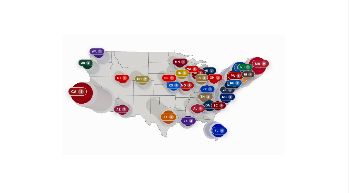
A chart may indicate that Stanford University is armed with the largest financial resources among different universities, but it does not point to the exact location where the power of the American education system resides. The same is true about the ranking list, which does not enable one to locate where the American education system is missing out on its own identity. It orders but does not connect the items on the list. It provides an answer to the question of who but leaves aside a ten times more significant question of where. Hence, we started with understanding resilience as location rather than the basis for the ranking list. In the resiliency rating “Too Big to Fail,” the efficiency of institutions is no longer dependent on the number on the list. Now the strength of institutions is expressed through their altitude above sea level.
The Five Variables — What We Measure and Why
Resilience is not just a feeling; it is a structure. The rating is based on five variables weighted according to the extent to which each affects an institution’s ability to withstand difficulty. The weights assigned to the five rating criteria are intentional. The weights are the pillars on which the structure stands.
Finance (35%): Money is the foundation. Therefore, it has the highest weight in the rating process. The absolute capability to survive an institution includes such aspects as the size of its endowments, total assets, endowments per student, and the number of full-time equivalent students.
Effects & Innovations (30%): The second aspect of a foundation of an institution is what it produces. Here we use factors that reflect the impact of research, federal and non-federal R&D contacts, awards for academic achievements, and inventions. This is the source of long-term significance—the ability to produce discoveries and ensure that even if it does not exist, the university continues to be important for the country that has been financing it.
Reputation & Perception (20%): Reputation is regarded as a significant asset granting gravitational power, and we treat it as such. This variable is a composite metric that combines data from QS, THE, WSJ, Forbes, and US News. No single ranking is used; the composite metric averages out the particularities of one methodology and presents an efficient measure of how widely the name over the gate is valued.
Sustainability & Governance (10%): The endurance of a system depends on its adaptive capacity to manage resources and governance over a span beyond the quarterly cycles. Based on the QS Sustainability framework, the efficiency of a company in terms of its longevity is assessed, not because it leads today.
Relevance & Brand Awareness (5%): The lowest in order of importance but not negligible. The media presence, online search interest, and digital footprint define the cultural content of the organization and its importance today.
Regarding the weights themselves, they are neither neutral nor something we hide. We are open about them and use them only after a lot of thinking about how to weigh the importance of resources to institutional life sustainability in relation to the branding issue.
The Turn — From Static Score to Spatial Topography
The main concept is present, so let’s summarize it: We need to take the composite score generated by these five variables, but instead only of putting it in the cell of the spreadsheet, let us depict it as elevation.
This way, we place any given institution on the actual three-dimensional map of the country where the institution’s resiliency score indicates its height. Thus, we are not making a chart anymore, but rather a mountain range of institutions’ power represented on the actual map of the country. If we observe Princeton and Yale as two different entries and look at how they appear in three-dimensional space, we will see them merge into a high peak complex in the northeastern part of the country, with flat lands in the center.
The first advantage is that we understand that power is centered in specific geographic regions. This map allows us to visualize this clustering. We no longer just infer that wealth is unevenly distributed in the United States. We can witness how wealth is scattered regionally across several regions and how different areas contribute to this clustering.
The second benefit comes from the fact that the spatial view allows one to comprehensively study a larger dataset. Instead of using the 25 institutions from the previous study, here we examine as many as 100 institutions and conduct the same analysis on these new data. With 25 institutions, we can establish the presence of peaks and top points; however, if we analyze 100 institutions, we can gain insights into the entire landscape with its valleys that surround the peaks and expose the weaknesses of the region. Please note that a single institution located in the valley may serve as the only peak in the surrounding area. Its closure will make it impossible to access the information. It will not be treated as one data point disappearing but will create a huge impact on the region and economy with no presence of surrounding peaks. The benefits derived from the analysis only give us misleading information about the region.
The Living Map — Interactive Scenario Modeling
The terrain is dynamic and constantly changing. The user can experiment by adjusting the value of a singular variable and seeing the results in front of their eyes occurring in front of them. If one applies an endowment tax, one can see which summits endure and which ones lose their height, as well as which sectors are going to slip down to the valley floor. Then one can virtualize the effect of federal finance regulations on the limits of creativity and draw some conclusions about changes in the height of different geographical areas. All actions described above are only possible because there has been a development in the way economists view the risks of their policies.
Why the Terrain Matters
The lesson for regulators and management is straightforward: you cannot lead what you don’t understand. A scorecard gives you an assessment, while a map gives you insight; that is, you can identify the places where you might be vulnerable before anything happens, and you know where your weak points are. The Resiliency Rating transforms a list of places into a map of the terrain and a map of the terrain into a tool for early detection. The high spots draw attention, but the real trick is in recognizing the specific places that may be problematic and addressing them before anything occurs.